Python Scatter Plot
Upgrade Your Skills, Upgrade Your Career - Learn more
Scatter plot in Python is one type of a graph plotted by dots in it. The dots in the plot are the data values. To represent a scatter plot, we will use the matplotlib library. To build a scatter plot, we require two sets of data where one set of arrays represents the x axis and the other set of arrays represents the y axis data.
matplotlib.pyplot.scatter()
Scatter plots are generally used to observe the relationship between the variables. The dots in the graph represent the relationship between the dataset. We use the scatter() function from matplotlib library to draw a scatter plot. The scatter plot also indicates how the changes in one variable affects the other.
Syntax
matplotlib.pyplot.scatter(xaxis_data, yaxis_data, s = None, c = None, marker = None, cmap = None, vmin = None, vmax = None, alpha = None, linewidths = None, edgecolors = None)
| Parameter | Description |
| xaxis_data | X axis data in an array |
| yaxis_data | Y axis data in an array |
| s | The marker size and it can be scalar or equal to the size of x or y array. |
| c | Color for the markers |
| marker | Style of the marker |
| cmap | Name of the cmap |
| linewidths | The width of the marker border |
| edgecolor | Color of the marker border |
| Alpha | Transparency value which lies between 0 and 1. 0 represents transparent and 1 represents opaque. |
All the parameters in the syntax are optional except the xaxis_data and yaxis_data. By default their value will be assigned to none.
Python Scatter() Function:
The scatter() function in matplotlib helps the users to create scatter plots. Once the scatter() function is called, it reads the data and generates a scatter plot.
Now, let’s create a simple and basic scatter with two arrays
Code of a simple scatter plot:
#importing library
import matplotlib.pyplot as plt
#datasets
students_id = [1,2,3,4,5,6,7,8,9,10]
students_marks = [95,98,83,75,67,58,67,78,53,32]
#scatter plot for the dataset
plt.scatter(students_id, students_marks)
plt.show()
Output:
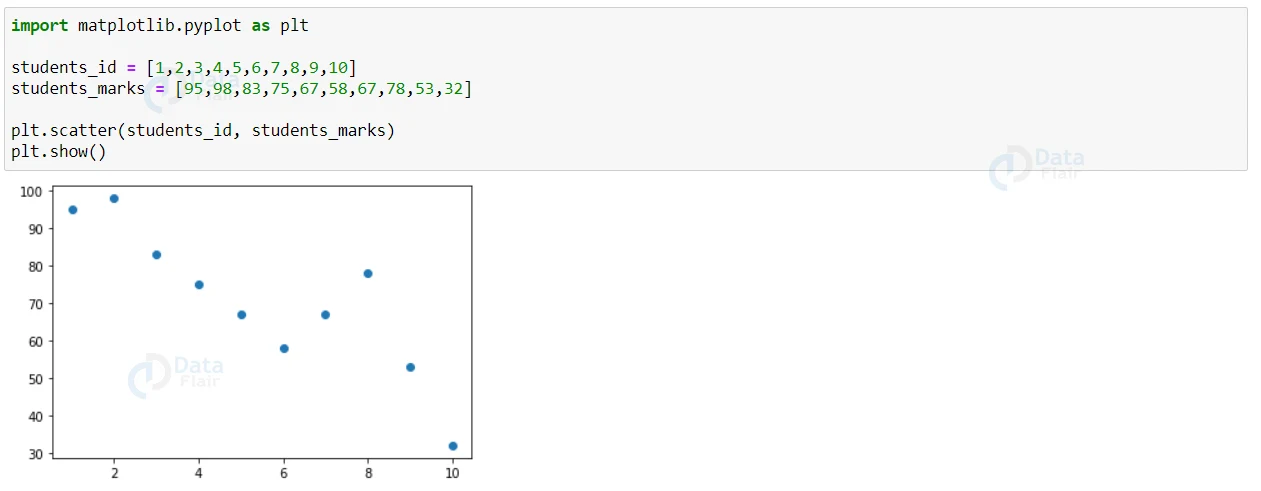
Here the x-axis represents the students id and the y-axis represents the students marks. Each and every dot in the plot is the representation of each student’s scores.
Scatter plot for Randomly Distributed Data
The dataset can contain ‘n’ number of values and the dataset can also contain randomly generated values. Now, let’s see a sample where there are two arrays filled with 100 random numbers using a normal data distribution.
The first array in the data set will have the mean set to 10 with a standard deviation of 2 and the second array in the dataset will have the mean set to 20 with a standard deviation of 5.
Code to implement scatter plot for randomly distributed data:
#importing library
import matplotlib.pyplot as plt
#datasets
students_id = [1,2,3,4,5,6,7,8,9,10]
students_marks = [95,98,83,75,67,58,67,78,53,32]
#scatter plot for the dataset
plt.scatter(students_id, students_marks)
plt.show()
Output:
The scatter plot can contain more than 100 values also and we can also see that the spread of the y axis is wider than the x axis. Though the values are randomly distributed, we can see many data points are mostly on the scale 10 on the x axis and 20 on the y axis as we have provided those values in the mean place.
Compare Plots in Python
Scatter plot can also contain more than one dataset in the graph. Lets see the sample code on how to compare two different datasets.
Code to compare two different datasets:
import matplotlib.pyplot as plt
import numpy as np
#Maths Marks
students_id = np.array([1,2,3,4,5,6,7,8,9,10])
students_marks = np.array([95,98,83,75,67,58,67,78,53,32])
plt.scatter(students_id, students_marks)

#science marks
students_id = np.array([1,2,3,4,5,6,7,8,9,10])
students_marks = np.array([58,90,67,78,53,32,95,98,83,67,])
plt.scatter(students_id, students_marks)

plt.show()
Output
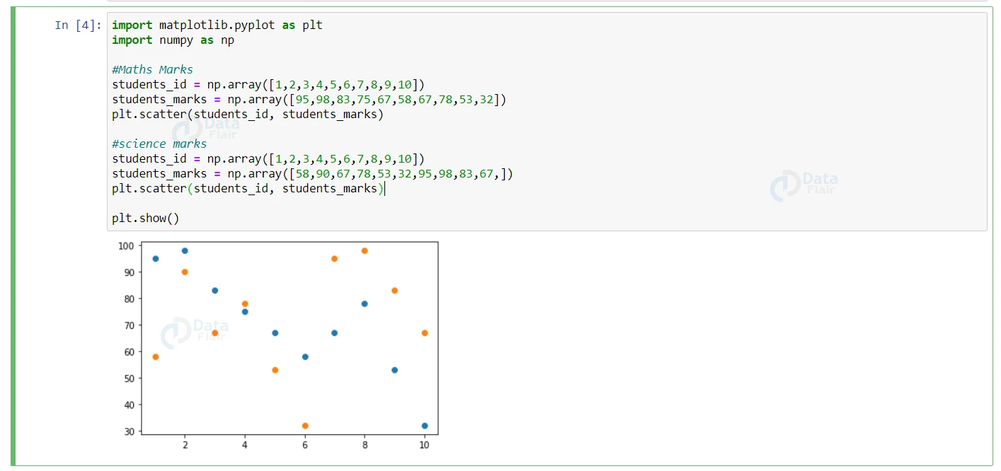
Now, from the above graph we are able to compare two subject marks of a particular class. By default the first dataset appears in the blue color and the second dataset appears in the orange color, we can also change the color as we want.
Let’s see a sample to change the colors in the graph.
Code to change colors in the graph:
import matplotlib.pyplot as plt
import numpy as np
#Maths Marks
students_id = np.array([1,2,3,4,5,6,7,8,9,10])
students_marks = np.array([95,98,83,75,67,58,67,78,53,32])
plt.scatter(students_id, students_marks, color= 'black')

#science marks
students_id = np.array([1,2,3,4,5,6,7,8,9,10])
students_marks = np.array([58,90,67,78,53,32,95,98,83,67,])
plt.scatter(students_id, students_marks, color = 'violet')

plt.show()
Output
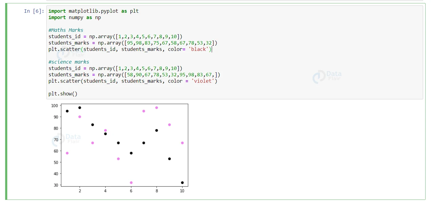
If we want to change the default colors of the graph, then we can change it by specifying the color name in the code. We can change the color of each dot in the graph.
Lets see the sample code of it
Code to customize each dot:
import matplotlib.pyplot as plt
import numpy as np#Maths Marks
students_id = [1,2,3,4,5,6,7,8,9,10]
students_marks = [95,98,83,75,67,58,67,78,53,32]
colors = np.array(["black","blue","violet","pink","yellow","red","green","maroon","orange","brown"])

plt.scatter(students_id, students_marks, c = colors)
plt.show()
Output:
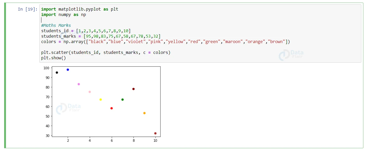
Each and every color of the dots are specified in the other array, therefore the color of each dot appears as such on the graph.
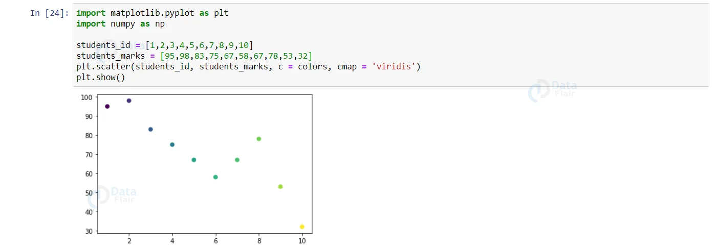
ColorMap in Python
The color map is a list of various colors which are available in the matplotlib library. Each and every color holds a unique value between 0 to 100.
How to use colormap in the scatter plot?
‘cmap’ is a keyword argument to specify the colormap and with the value of the colormaps in the code, we can specify it using the keyword ‘viridis’ as it is one of the built-in colormaps in the matplotlib library.
Code to customize the color in graph:
import matplotlib.pyplot as plt
import numpy as np
students_id = [1,2,3,4,5,6,7,8,9,10]
students_marks = [95,98,83,75,67,58,67,78,53,32]
plt.scatter(students_id, students_marks, c = colors, cmap = 'viridis')
plt.show()
Output:
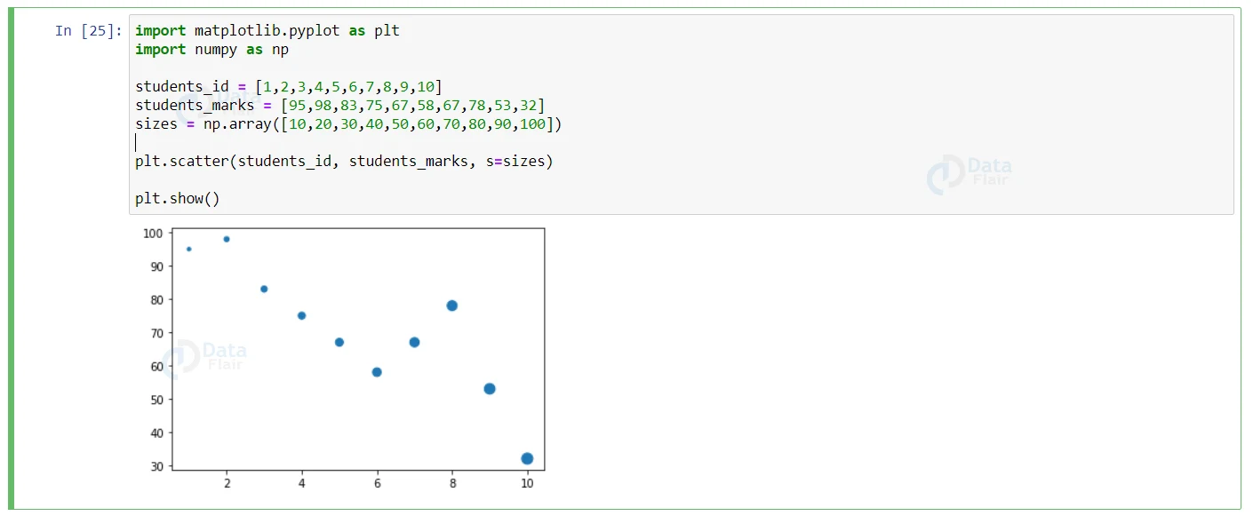
Size:
We can also change the size of the dots in the graph by specifying the size of the dots in an individual array in the code.
Lets see a sample code on how to change the size of the dots.
Code to increase or decrease the size:
import matplotlib.pyplot as plt
import numpy as np
students_id = [1,2,3,4,5,6,7,8,9,10]
students_marks = [95,98,83,75,67,58,67,78,53,32]
sizes = np.array([10,20,30,40,50,60,70,80,90,100])

plt.scatter(students_id, students_marks, s=sizes)

plt.show()
Output:
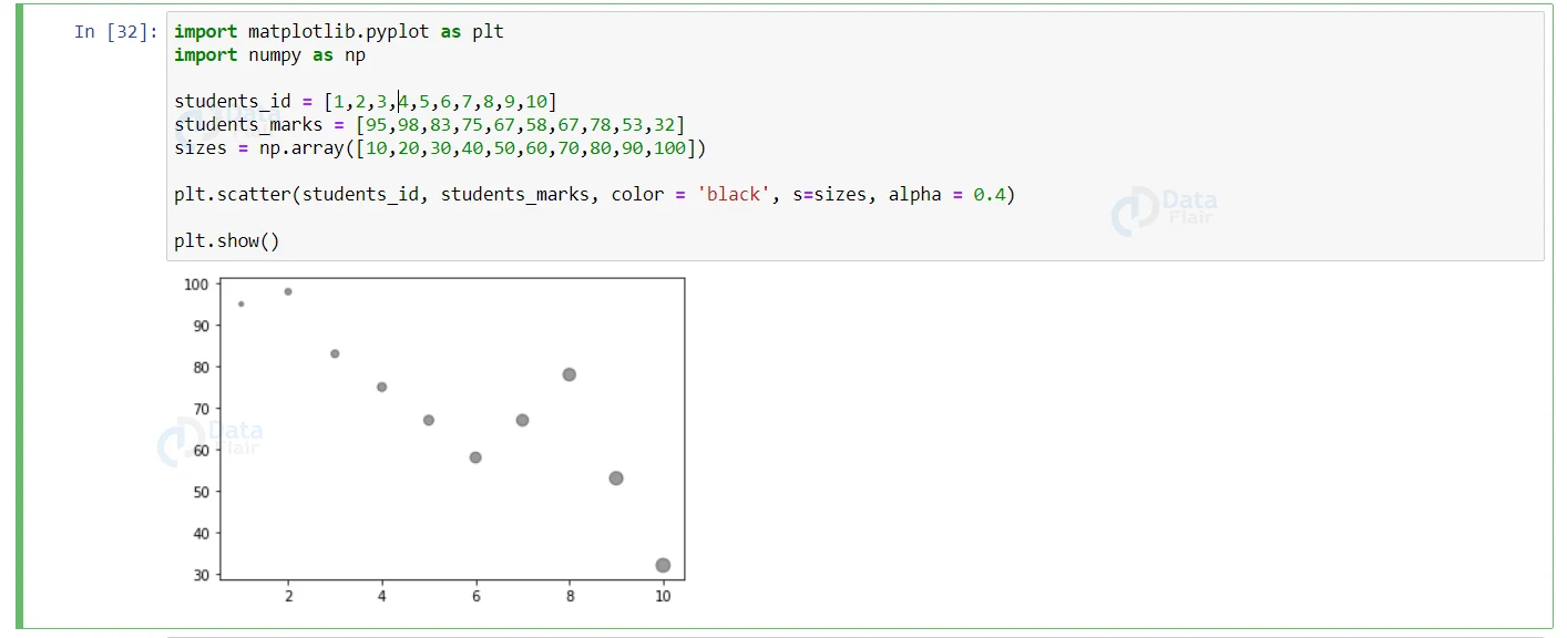
Alpha:
The user can also modify the transparency of the dots in the graph. To indicate the transparency, we use the ‘alpha’ argument. The alpha ranges from 0 to 1. The 0 in the range indicates full transparency and the 1 in the range indicates the opaque.
Code to increase or decrease the transparency :
import matplotlib.pyplot as plt
import numpy as np
students_id = [1,2,3,4,5,6,7,8,9,10]
students_marks = [95,98,83,75,67,58,67,78,53,32]
sizes = np.array([10,20,30,40,50,60,70,80,90,100])

plt.scatter(students_id, students_marks, color = 'black', s=sizes, alpha = 0.4)

plt.show()
Output:
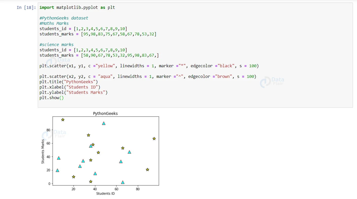
Shapes:
The user can customize the representation shape in the graph. By default it appears in dot but it can be customized to square, triangle, star etc.
Code to implement python scatter plot with different shapes:
import matplotlib.pyplot as plt
#PythonGeeks dataset
#Maths Marks
students_id = [1,2,3,4,5,6,7,8,9,10]
students_marks = [95,98,83,75,67,58,67,78,53,32]

#science marks
students_id = [1,2,3,4,5,6,7,8,9,10]
students_marks = [58,90,67,78,53,32,95,98,83,67,]

plt.scatter(x1, y1, c ="yellow", linewidths = 1, marker ="*", edgecolor ="black", s = 100)

plt.scatter(x2, y2, c = "aqua", linewidths = 1, marker ="^", edgecolor ="brown", s = 100)
plt.title("PythonGeeks")
plt.xlabel("Students ID")
plt.ylabel("Students Marks")
plt.show()
Output:
Conclusion:
Scatter plot in python is one of the graphs which helps the users to indicate each and every data value on the plot. In the scatter plot, we can also change the color, size and alpha value of the data points in the graph.