Python Matplotlib Introduction
Boost Your Career with In-demand Skills - Start Now!
Data Visualization makes the analysis process simpler as we can easily identify the trends, patterns, etc. on the graphs, especially for huge amounts of data. In this article, we will be learning to plot different graphs and setting other properties of the graphs using the Python module Matplotlib. We will start with the introduction and then go forward to the implementation.
What is Matplotlib?
Matplotlib is a low-level or 2-dimensional plotting Python library that helps in data visualization. It is an open-source and free library created by John Hunter.
Matplotlib is a multi-platform library built on NumPy arrays and designed to work with the broader SciPy stack. It is mostly written in python with a few segments written in C, Objective-C, and Javascript for Platform compatibility. It can be used in different graphical user interface toolkits such as python scripts, shell, web application servers, etc.
Pyplot is a module in the Matplotlib module which provides a MATLAB-like interface. With this, we can build line plots, histograms, bar charts, scatter plots, etc. In addition, we can also set the features for these plots which include labels, font properties, axes properties, line styles, etc.
Installing the required Libraries
We need two libraries here, namely, NumPy and Matplotlib. We can install them by using the below statements
pip install numpy
pip install matplotlib
Line Plot
Line plots are the basic plots where the points get connected via a line or a curve. We will discuss ways to draw the line plots and setting their different properties using matplotlib in this section.
Simple plot
Let us start with a simple plot where we draw a straight line.
Example of a line plot:
#importing required module
import matplotlib.pyplot as plt

plt.plot([1,2,3],[2,4,6]) #plotting the graph with the 1st list as x-axis and 2nd list as y-axis
plt.show() #displaying the plot
Output:

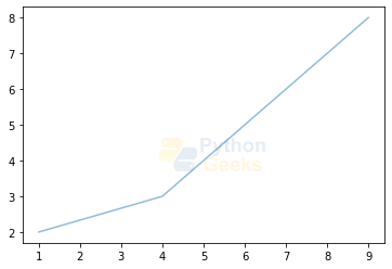
Showing Grid
Sometimes it is more comfortable to view the values when with a grid as background. This module also facilitates adding a grid to the plots. Let us add the grid to the above graph.
Example of a line plot with grid:
#importing required module
import matplotlib.pyplot as plt

plt.grid(True) #setting the grid
plt.plot([1,2,3],[2,4,6]) #plotting the graph with the 1st list as x-axis and 2nd list as y-axis
plt.show() #displaying the plot
Output:

Setting properties of plots
We can also set different properties to the plots by using the respective functions as done in the case of the grid. Let us see each of these:
1. Xlabel:
This can be used to add the label to the x-axis. We can do this by using the method xlabel() and the syntax is plt.xlabel(Lable_name)
2. Ylabel:
This can be used to add the label to the y-axis of the plot. We can use the ylabel() method and the syntax is plt.ylabel(Lable_name)
3. Title:
This is used to set the title of the entire plot. We have a function title() for this purpose.
Now let us see an example by adding these properties.
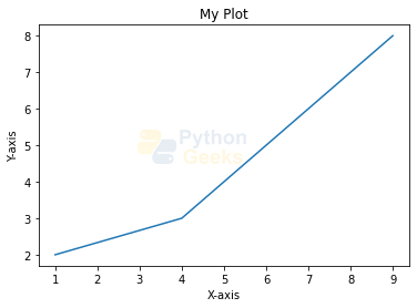
Example of a plot with properties added:
#importing required module
import matplotlib.pyplot as plt


plt.plot([1,4,9],[2,3,8]) #plotting the graph with the 1st list as x-axis and 2nd list as y-axis

plt.title('My Plot') #adding title to the plot
plt.xlabel('X-axis') #adding label to the x-axis
plt.ylabel('Y-axis') #adding label to the y-axis

plt.show() #displaying the plot
Output:
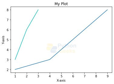
Two graphs on a plot
We can also have two graphs on the same plot. And we can distinguish by setting some more properties like color and we can also label them as shown in the below variable.
Example of a plotting two graphs :
#importing required module
import matplotlib.pyplot as plt


plt.plot([1,4,9],[2,3,8],label='line 1') #plotting the graph with the 1st list as x-axis and 2nd list as y-axis
plt.plot([1,2,3],[3,6,8],'c',label='line 2')  #plotting another graph

plt.title('My Plot') #adding title to the plot
plt.xlabel('X-axis') #adding label to the x-axis
plt.ylabel('Y-axis') #adding label to the y-axis

plt.show() #displaying the plot
Output:
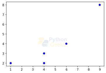
Formatting your Plot
Rather than a continuous line, we can set different shapes like circles, squares, triangles, etc., and can also set colors for these like blue, green, etc. Let us see an example.
Example of formatting the plot :
#importing required module
import matplotlib.pyplot as plt

plt.plot([1,4,9,6,4],[2,3,8,4,2],'bo')
plt.show() #displaying the plot
Output:
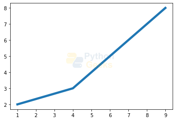
Some Other Line Properties
In addition to the above ones, the line plots have specific properties. These include:
1. Linewidth
This sets the width of the line joining the points.
Example of a linewidth property:
#importing required module
import matplotlib.pyplot as plt

plt.plot([1,4,9],[2,3,8],linewidth=4.5)
plt.show() #displaying the plot
Output:
2. Alpha
This sets the intensity of the color of the line.
Example of alpha property:
#importing required module
import matplotlib.pyplot as plt

plt.plot([1,4,9],[2,3,8],alpha=3.5)
plt.show() #displaying the plot
Output:
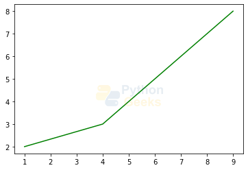
3. Color
This is used to set the color of the line.
Example of a color property:
#importing required module
import matplotlib.pyplot as plt

plt.plot([1,4,9],[2,3,8],color='green')
plt.show() #displaying the plot
Output:
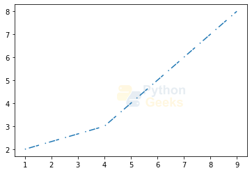
4. Dashes
This is used to draw a dashed line rather than a continuous line.
Example of a dashes property:
#importing required module
import matplotlib.pyplot as plt

plt.plot([1,4,9],[2,3,8],dashes=[1,3,6])
plt.show() #displaying the plot
Output:
5. Marker
These are used to set the markers at the points which we are using to plot the graph. We have different markers like x,.,+, and so on.
Example of a marker property:
#importing required module
import matplotlib.pyplot as plt

plt.plot([1,4,9],[2,3,8],marker='x')
plt.show() #displaying the plot
Output:

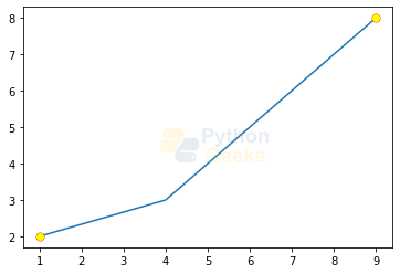
In addition, we can add different properties to these markers like color, width, face color, and size. In addition, we also have a property using which we can decide on which points the marker should be set and this is called mark every. Let us see an example with these properties set.
Example of a marker property:
#importing required module
import matplotlib.pyplot as plt

plt.plot([1,4,9],[2,3,8],marker='.',markeredgecolor='red',
         markeredgewidth=0.4,markerfacecolor='yellow',
         markersize=15.0,markevery=2)
plt.show() #displaying the plot
Output:
6. Zorder
When we plot two graphs and when they coincide at some values, then this attribute decides which line to be dominant.
Example of a linewidth property:
# importing required module
import matplotlib.pyplot as plt

plt.plot([1,4,9],[2,3,8],zorder=1,color='blue')
plt.plot([1,4,10],[2,3,6],zorder=2,color='red')
plt.show() #displaying the plot
Output:

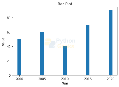
Bar Plot
A bar graph is used to compare data among different categories. The values are represented via bars and hence its name. The length of the bar represents the value. It is very useful when we want to measure the changes over a period of time.
Example of a bar plot:
# importing required module
from matplotlib import pyplot as plt

plt.bar([2000,2005,2010,2015,2020],[50,60,40,70,90]) #plotting a bar plot
plt.xlabel('Year')
plt.ylabel('Value')
plt.title('Bar Plot')
plt.show()
Output:
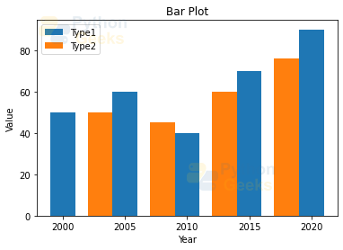
We can set the width of the plot by using the width attribute. We can also have two different bar plots on the same figure.
Example of two bar plots:
# importing required module
from matplotlib import pyplot as plt

plt.bar([2000,2005,2010,2015,2020],[50,60,40,70,90],label="Type1",width=2.0) #plotting a bar plot

plt.bar([2003,2008,2013,2018],[50,45,60,76],label="Type2",width=2.0) #plotting another bar plot
plt.legend()
plt.xlabel('Year')
plt.ylabel('Value')
plt.title('Bar Plot')
plt.show()
Output:
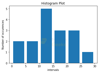
Histogram Plot
Histograms are the plots used to show a distribution of the values. These are different from bar plots which are used to compare different entities. The histograms are used to show the number of values or frequency of values in a given interval. And the bins are used to represent frequency.
Example of histogram plot:
import matplotlib.pyplot as plt

values = [23,12,10,24,17,7,22,19,5,3,10,29,15,12,10,4]

bins = [0,5,10,15,20,25,30] #represents the interval at which each bin should occur. Here the bins occur from 0-5, 5-10,...

plt.hist(values, bins, histtype='bar', rwidth=0.8)
plt.xlabel('intervals')
plt.ylabel('Number of occurrences')
plt.title('Histogram Plot')
plt.show()
Output:
Scatter Plot
The scatter plots are used to compare variables, that is, to know how much one variable is affected by another one. The plot has a collection of points, each having the value of one variable as per the position on the horizontal axis and the other coordinate of the position determined by the other variable on the vertical axis.
Example of scatter plot:
import matplotlib.pyplot as plt

var1=[1,2,3,4,5,6,7]
var2=[3,6,4,3,2,2,1]
plt.scatter(var1,var2,color='g')
plt.xlabel('var1')
plt.ylabel('var2')
plt.title('Scatter Plot')
plt.show()
Output:

Area Plot
These are similar to the line plot but these are used to represent the changes over time for two or more related types that come under one category. These are also known as stack plots. For example, let’s see the different amounts of work done on the weekdays.
Example of area plot:
import matplotlib.pyplot as plt

days = [1,2,3,4,5]

work1 =[3,4,6,2,5]
work2 = [2,7,2,3,9]
work3 =[5,4,2,8,3]

plt.plot([],[],color='g', label='work1', linewidth=5)
plt.plot([],[],color='c', label='work2', linewidth=3)
plt.plot([],[],color='r', label='work3', linewidth=5)

plt.stackplot(days,work1, work2,work3,colors=['g','c','r'])

plt.xlabel('days')
plt.ylabel('work done')
plt.title('Area Plot')
plt.legend()
plt.show()
Output:

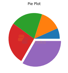
Pie Chart
We would be familiar with this plot. A circle is used to represent proportions occupied by different segments.
Example of area plot:
import matplotlib.pyplot as plt

x = [1, 2, 3, 4,5] #different proportion taken by different types
e  =(0, 0, 0, 0,0.1) #This will separate/explode the last wedge from the chart

plt.pie(x, explode = e)
plt.title('Pie Plot')
plt.show()
Output:
SubPlots
We can have multiple plots in the same figure by using the property of subplots. In this, we can create a figure and add_subplots() by specifying the number of rows and columns we need to place the different plots. Let us see an example for further understanding.
Example of the subplots:
import numpy as np
import matplotlib.pyplot as plt

x = np.arange(0,6,1) #[0,1,2,3,4,5]
y1 = x*x
y2=x*2
y3=x**3

#number of rows, number of columns, the location where the first plot is potted
plt.subplot(2,2,1)
plt.plot(x,x)
plt.title('x')

plt.subplot(2,2,2)
plt.plot(x,y1)
plt.title('y1')

plt.subplot(2,2,3)
plt.plot(x,y2)
plt.title('y2')

plt.subplot(2,2,4)
plt.plot(x,y3)
plt.title('y3')

plt.show()
Output:

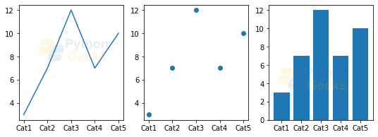
Plotting Categorical Variables
Till now we saw how to plot numerical values. Let us see an example where we plot the categorical data.
Example of plotting categorical data:
import numpy as np
import matplotlib.pyplot as plt

categories=["Cat1","Cat2","Cat3","Cat4","Cat5"]
vals=[3,7,12,7,10]
plt.figure(figsize=(9,3)) #setting size of the figure

#number of rows, number of columns, the location where the first plot is potted
plt.subplot(1,3,1)
plt.plot(categories,vals)

plt.subplot(1,3,2)
plt.scatter(categories,vals)

plt.subplot(1,3,3)
plt.bar(categories,vals)

plt.show()
Output:
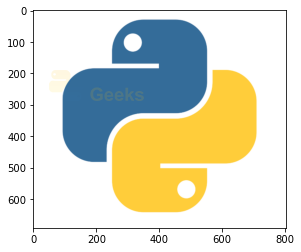
Showing images
Finally, let us also see how to show images using matplotlib. We will be loading the image first and then displaying it.
Example of plotting categorical data:
# importing required libraries
import matplotlib.pyplot as plt
import matplotlib.image as img

image = img.imread('D:\\pic.png')# reading the image
plt.imshow(image)# showing the image
Output:
Interview Questions on Python Matplotlib
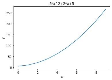
1. Write a program to the equation 3*x^2 +2*x+5
Ans.
Example of:
import numpy as np
import matplotlib.pyplot as plt

x=np.arange(0,10,1)
y=3*x*x+2*x+5
plt.plot(x,y)
plt.xlabel('x')
plt.ylabel('y')
plt.title('3*x^2+2*x+5')
plt.show()
Output:
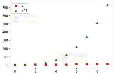
2. Write a program to plot two graphs on the same plot with one having square and the other having triangular formatting.
Ans.
Example of:
import numpy as np
import matplotlib.pyplot as plt

x=np.arange(0,10,1)
plt.plot(x,x,'rs',label='x')
plt.plot(x,x**3,'g^',label='x^3')
plt.legend()
plt.show()
Output:
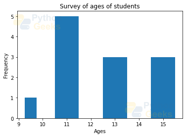
3. Write a program to plot a histogram to represent the ages of students in the class.
Ans.
Example of:
import matplotlib.pyplot as plt

ages = [9,10,15,11,12,13,12,19,10,10,11,15,14]

bins = [9,10,12,14,16]

plt.hist(ages, bins, histtype='bar', rwidth=0.5)
plt.xlabel('Ages')
plt.ylabel('Frequency')
plt.title('Survey of ages of students')
plt.show()
Output:
4. Write a program to plot sine and cosine waves on subplots with axes from 0 to 2𝝅.
Ans.
Example of:
import matplotlib.pyplot as plt
import numpy as np

x = np.linspace(0, 2*np.pi, 50)

plt.subplot(2,1,1)
plt.plot(x, np.sin(x))
plt.title('sin(x)')

plt.subplot(2,1,2)
plt.plot(x, np.cos(x))
plt.title('cos(x)')

plt.show()
Output:

5. Write a program to load an image and show it on a gray scale.
Ans.
Example of:
import matplotlib.pyplot as plt
import matplotlib.image as img

image = img.imread('D:\\pic.png')
plt.imshow(image[:,:,1],cmap='gray')
Output:

Conclusion
We are at the end of the article. In this article, we learned about different plots and plotting them using matplotlib. We also saw setting different properties. Then we saw subplots and also showing images using matplotlib.
Hoping that this article gave you some knowledge on matplotlib. Happy coding!