Python Histogram
From learning to earning – Courses that prepare you for job - Enroll now
Python Histogram
A histogram is one type of a graph and they are basically used to represent the data in the graph forms. It is actually one of the best methods to represent the numerical data distribution. In histogram, the x axis represents the bin ranges and the y axis represents the information about the frequency of the data.
What is a Histogram?
A histogram is a type of a graph which indicates the frequency distribution. It is generally a graph which shows the number of observations between each interval.
Lets see a sample on how to read a histogram
For example: If we have 10 students mark record as below
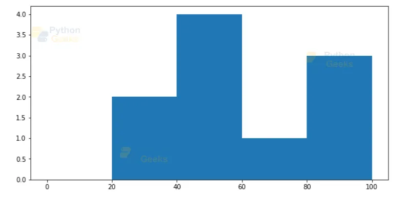
From the graph, we can observe that there are 2 students who have scored between 20 and 40, 4 students who have scored between 40 and 60, 1 student who have scored between 60 and 80 and 3 students who have scored between 80 and 100.
How to create bin ranges?
In order to create bin ranges, split the whole range of values in the dataset into a set of intervals. After setting the interval, count the data values which fall into specific intervals. This is how the data values are distributed to the bin ranges in the histogram. Bins are created as consecutive and non-overlapping intervals.
Histogram using Matplot library
Using the matplot library in python, we can build a better histogram with its assistance. We can use the matplot library to create a basic version and then we can also use the library to customize the histogram.
Python Hist() Function:
The hist() function in matplotlib helps the users to create histograms. It reads the array of a numpy and sends it as an argument to the function. Once the hist() function is called, it reads the data and generates a histogram.
Parameters of matplot.hist() function
| Parameter | Description |
| a | It defines the array which has to be computed. |
| bins | It is an optional parameter and it is represented either in integer or sequence or ‘auto’. |
| range | Range indicates the lower and upper range and it is one of the optional parameters. |
| density | If the value is set to True then it will return a probability density whereas if it is set to False then it will not return a probability density of the datavalues. It is one of the optional parameters. |
| cumulative | If cumulative is set to True, then the histogram is computed calculating the counts of each bin adding the bin values for smaller values. It is also one of the optional parameters and we don’t set the cumulative value to false, we either set it to true or else leave it without mentioning. |
| histtype | It represents the type of histogram to draw. By default, the histogram is represented in a bar graph. There are also other types available such as bar stacked, step and stepfilled. |
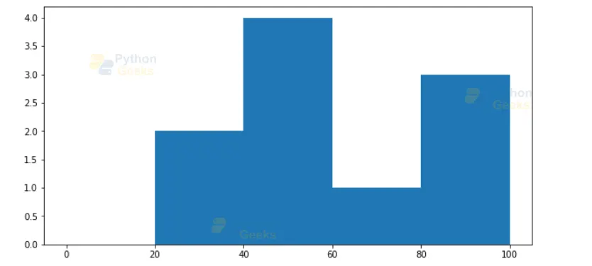
Now, let’s create a simple and basic histogram
Code for simple Histogram:
#importing required libraries
from matplotlib import pyplot as plt
import numpy as np

# A dataset of 10 students
marks = np.array([98, 89, 45, 56, 78, 25, 43, 33, 54, 100])
fig, axis = plt.subplots(figsize =(10, 5))
axis.hist(marks, bins = [0, 20, 40, 60, 80, 100])

# Displaying the graph
plt.show()
Output for simple Histogram:

With the above code, you can create a simple histogram but if you want to customize your histogram, then you can also do it. You can also change the alignment, size and color of your histogram. The following below code helps you to customize your histogram.
Steps to plot a histogram using Matplotlib:
Step 1: Enter the following command under windows to install the Matplotlib package if not installed already.
pip install matplotlib
Step 2: Enter the data required for the histogram.
For example, we have a dataset of 10 student’s.
Marks: 98, 89, 45, 56, 78, 25, 43, 33, 54, 100
Step 3: Verify the number of bins for the dataset.
The user can either set the bins manually or the code itself decides it according to the dataset.
Step 4: Let’s plot the histogram using matplotlib package.
Code to plot histogram:
#importing required libraries
from matplotlib import pyplot as plt
import numpy as np
# A dataset of 10 students
marks = np.array([98, 89, 45, 56, 78, 25, 43, 33, 54, 100])
fig, axis = plt.subplots(figsize =(10, 5))
axis.hist(marks, bins = [0, 20, 40, 60, 80, 100])
# Displaying the graph
plt.show()
Step 5: When we run the above code, the following output appears
Output of plotting a histogram using matplotlib package:
Another way to determine the number of bins
Usually we set the number of bins to 10. In other way, we can derive the bins using the following formulas.
| Formula | Description |
| n | Number of observations |
| Number of intervals | Square Root of n |
| Range | Maximum Value – Minimum Value in the dataset. |
| Intervals width | Range / Number of intervals. |
The user can use the above formulas to create a frequency table.
Recall our dataset of 10 students: 98, 89, 45, 56, 78, 25, 43, 33, 54, 100
Using the formulas:
- n = number of observations = 10
- Range = maximum value – minimum value = 100 – 25 = 75
- Number of intervals = √n = √10 = 3.16 ~ 3 or 4
- Width of intervals = Range / (Number of intervals) = 75/3 = 25
Based on this information, the frequency table would look like this:
| Intervals | Frequency |
| 25 – 50 | 3 |
| 50 – 75 | 2 |
| 75 – 100 | 5 |
To calculate the exact number of bins in the histogram, we can use the following formulas but as our data is a student data, we have splitted the bin accordingly such as ([0 – 20],[20-40,[40-60],[60-80],[80-100]).
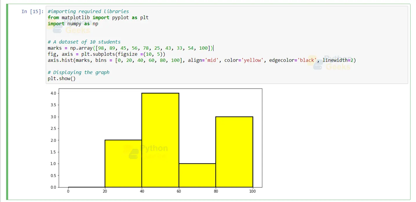
Customizing the histogram in python
The user can customize the size, color and alignment of the histogram.
Code for customizing Python Histogram:
#importing required libraries
from matplotlib import pyplot as plt
import numpy as np

# A dataset of 10 students
marks = np.array([98, 89, 45, 56, 78, 25, 43, 33, 54, 100])
fig, axis = plt.subplots(figsize =(10, 5))
axis.hist(marks, bins = [0, 20, 40, 60, 80, 100], align='mid', color='yellow', edgecolor='black', linewidth=2)

# Displaying the graph
plt.show()
Output for customizing the Histogram:
Histogram using Seaborn library
Seaborn is also one of the best python libraries to quickly build a histogram using the displot() function. Let’s build an histogram graph using the seaborn library.
Code for Histogram using Seaborn Package:
#import library
import seaborn as sns
#Iris Dataset
data = sns.load_dataset('iris')

#Using distplot function, create a graph
sns.distplot( a=data["sepal_width"], hist=True, kde = False, rug = False)
Output of histogram with kde and rug
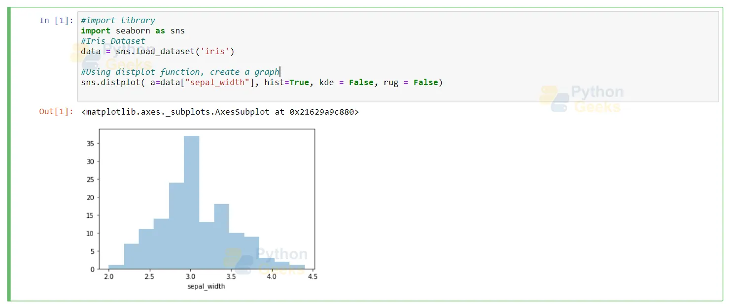
Here, if we don’t mention the kde and rug as false then the histogram appears with a curve in the graph. Hence, in order to remove those curves from the histogram, we mention those two parameters as false.
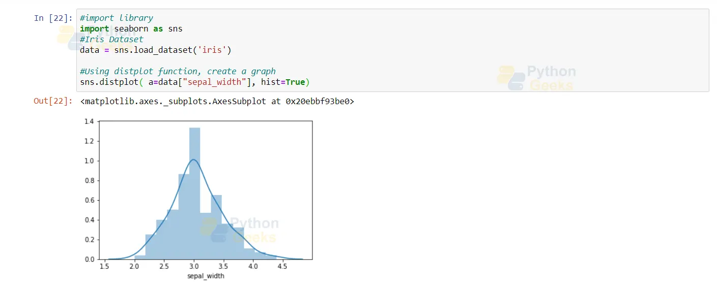
Histogram without Kde and Rug:
In the code below, we haven’t mentioned anything about the kde and rug and so the graph appears with a curve indicating the distribution of the data
Histogram Code without Kde and Rug:
#import library
import seaborn as sns
#Iris Dataset
data = sns.load_dataset('iris')

#Using distplot function, create a graph
sns.distplot( a=data["sepal_width"], hist=True)
Output of histogram without kde and rug:
Histogram in pure python:
The users can use the histogram in a pure python method when you want to know about the distribution of each number in the data. The histogram in the pure python method is much like a frequency table representation. The below code helps you to build a histogram in pure python.
Code in Pure Python:
# Data which need not be sorted but if not sorted then it starts in the specified order only
marks = (98, 89, 45, 54, 78, 25, 43, 33, 54, 100)

def count_elements(ele) -> dict:
 hist = {}
 for i in ele:
  hist[i] = hist.get(i, 0) + 1
 return hist

counted = count_elements(marks)
counted
Output of pure python:

The user can confirm whether the handmade function is correct or not using the collections.counter function. It tests for the equality between the two outputs.
Code to verify whether the handmade function is correct:
from collections import Counter
recount = Counter(marks)
recount

To test whether both the results are same, we use the below line of code:

recount.items() == count.items()
Output of the handmade function code:

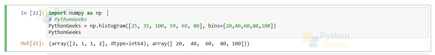
Creating Histogram using numpy.histogram()
There is a python module which provides a function named numpy.histogram(). Numpy.histogram() is also similar to the function hist() from the matplotlib package. The numpy.histogram() function represents the distribution of data values with a set of ranges. In simple terms we can say that this function helps the user to compute the histogram of the set of data.
Syntax:
numpy.histogram(a, bins=5, range=None, normed=None, weights=None, density=None)
Parameters:
| Parameter | Description |
| a | Defines the array which has to be computed |
| bins | It is an optional parameter and this indicates the int or sequence of the string or scalar. Both the uniform and non uniform bin widths can be calculated according to the range. The advanced version of numpy allows the user to set bin parameters as a string and finds a way to calculate optimal bin width. |
| range | This defines the lower and upper range of the bins and it is one of the optional parameters. But if the user enters the range then they should ensure that the first element value is less than or equal to the second element. |
| Normed | It is the same as the density argument and sometimes it might show the wrong output for unequal bin widths. It is also an optional parameter. |
| weights | Defines an array which indicates the weights and has the same shape as ‘a’. |
| Density | If the value is set to True then it will show the number of samples in every bin whereas if it is set to False then it will show the probability density function in the bin. |
The syntax returns the array from the hist, edge_bin returns the float dtype array, the function bin edges returns the (length(hist+1)) and the density function returns the value of the histogram.
Code to show the distribution of dataset using numpy:
import numpy as np
# PythonGeeks

PythonGeeks = np.histogram([25, 35, 100, 59, 69, 80], bins=[20,40,60,80,100])

PythonGeeks
Output of showing the distribution of dataset using numpy:
Code to display the output if density is True:
import numpy as np
PythonGeeks = np.histogram(np.arange(10), bins=np.arange(5), density= True)
PythonGeeks
Output of the code if density is true

Code to Implement the sum of histogram values
import numpy as np
PythonGeeks = np.arange(5)
hist, bin_edges = np.histogram(PythonGeeks, density=False)
hist
hist.sum()
np.sum(hist * np.diff(bin_edges))
Output of implementing the sum of histogram values:

Summary
Histogram is a type of graph which indicates the numeric distribution of the data using the bin values. To create histogram graphs, we can either make use of the seaborn or matplotlib library. After importing the required libraries, we can create simple to advanced histograms as per our demand.

Excellent explanation
Excellent. I am B.tech(elect);also did pg in materials for elect equipment & also practiced energy audit. Now I am 77 learning python. Hope will get help from time to time
Excellent. I am B.tech(elect);also did pg in materials for elect equipment & also practiced energy audit. Now I am 77 learning python. Hope will get help from time to time