Charts in Python with Examples
Get Job-ready with hands-on learning & real-time projects - Enroll Now!
This is another article to visualize data using Python. We all know that data visualization makes the analysis process easier and also lets us get better insights. In this article, we will be covering some more interesting concepts of Python charts. We will be using the modules Pandas, numpy, and Matplotlib.
Python Modules for Plotting charts
As said above, we will be using the Pandas, NumPy, and Matplotlib modules for drawing different chars. We can install these modules by writing the below commands.
pip install pandas
pip install matplotlib
pip install numpy
Now let us discuss different charts we can plot using Python.
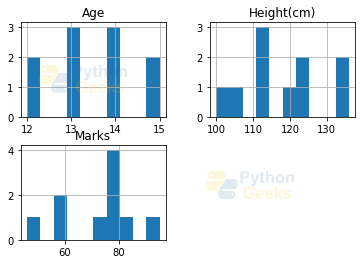
Histogram in Python
The histogram is used to find the frequency of occurrence of values in defined intervals. Let us create a data frame and plot the histogram of different numerical columns just by using a few lines of code.
Example of a histogram:
# import required modules
import pandas as pd
import matplotlib.pyplot as plt

# create 2D array of student details
stdData = [['S1', 'M', 13, 123, 46],
        ['S2', 'M', 12, 134, 82],
        ['S3', 'F', 14, 114, 77],
        ['S4', 'M', 13, 136, 73],
        ['S5', 'F', 13, 107, 56],
        ['S6', 'F', 12, 121, 80],
        ['S7', 'M', 14, 113, 76],
        ['S8', 'F', 15, 123, 95],
        ['S9', 'F', 14, 112, 78],
        ['S10', 'M', 15, 100,60] ]

# creating the dataframe from the above data
df = pd.DataFrame(stdData, columns = ['ID', 'Gender','Age', 'Height(cm)','Marks'] )

df.hist()# create histogram for the numeric data(Age, Height,Marks)
plt.show() #displaying the plot
Output:
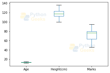
Box Plot Chart in Python
A box plot is used to represent statistical data graphically based on the minimum, maximum, first quartile, median, and third quartile. The graph looks similar to a rectangle with lines extending from the top and bottom. So the name box plot. Let us see the box plot for the above created data frame.
Example of a box plot:
df.plot.box() # Plotting box plot for each numeric column of the student dataframe df
plt.show()
Output:
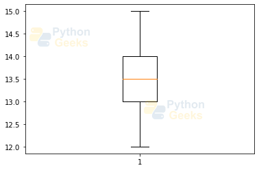
We can also plot for one of the columns as shown in the below example.
Example of a box plot for one of the columns:
plt.boxplot(df['Age']) # box plot for one of the column  attribute
plt.show()
Output:
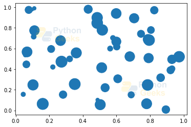
Bubble Chart in Python
A bubble chart is like a scatter plot with another dimension. In this larger bubbles represent larger values. Let us see an example.
Example of a bubble chart:
import numpy as np
import matplotlib.pyplot as plt

#creating 3 variables holding an array of 50 random values in the range 0 to 1
x=np.random.rand(50)  #represents the x axes coordinates
y=np.random.rand(50) #represents the y axes coordinates
sizes=np.random.rand(50) #represents the values and thus the size of the bubbles
plt.scatter(x,y,s=sizes*500)
plt.show()
Output:
We can set different properties to the bubble charts which include:
1. Adding title, labels
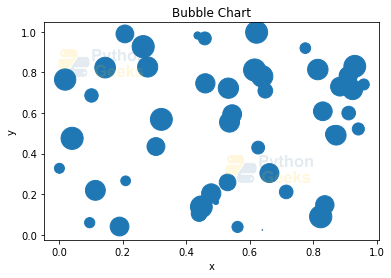
Example of bubble chart with title and labels:
plt.scatter(x,y,s=sizes*500)
plt.title('Bubble Chart') #adding title to the chart
plt.xlabel('x') #adding label for the x axes
plt.ylabel('y')  #adding label for the y axes
plt.show()
Output:
2. Color
We can set the color of the bubbles by setting the attribute ‘c’ which refers to the color.
Example of bubble chart with color set :
Output:
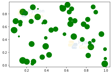
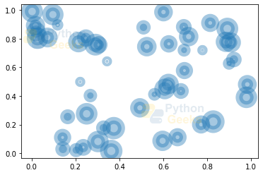
We can also set the intensity of the colors using the alpha parameter.
Example of bubble chart with color set :
plt.scatter(x,y,s=sizes*500,c='green',alpha=0.4)
plt.show()
Output:
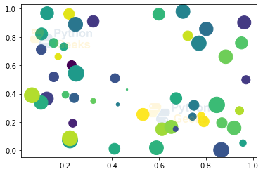
We can also set colors to different bubbles by giving a list of values that has the same number of values as x,y, and size.
Example of bubble chart with color set :
colors_list=np.random.rand(50)
plt.scatter(x,y,s=sizes*500,c=colors_list)
plt.show()
Output:
3. Shape
In the above examples, we saw that the shape was circular. Instead, we can set the shape to be triangular, square, etc. b setting the ‘marker’ parameter.
Example of bubble chart with shape set :
plt.scatter(x,y,s=sizes*500,marker='^')
plt.show()
Output:
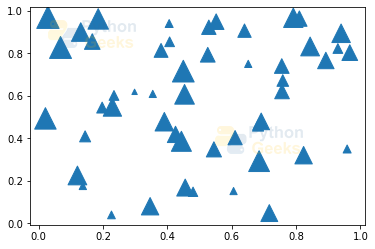
Example of bubble chart with shape set :
plt.scatter(x,y,s=sizes*500,marker='*')
plt.show()
Output:

4. Edge width
We can set the width of the edges by setting the attribute ‘linewidth’.
Example of bubble chart with edge width :
plt.scatter(x,y,s=sizes*500,alpha=0.4,linewidth=10)
plt.show()
Output:
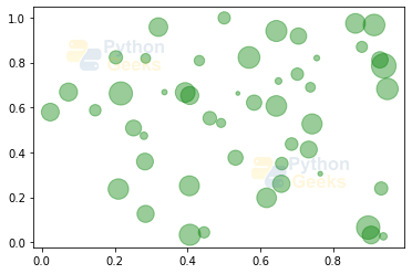
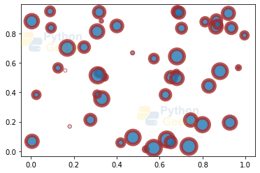
We can also set the color of the edge using ‘edgecolors’ attribute.
Example of bubble chart with edge color :
plt.scatter(x,y,s=sizes*500,linewidth=5,edgecolors='brown',alpha=0.8)
plt.show()
Output:
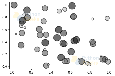
5. Mapping color
We can also map the intensity of a colormap to an array.
Example of bubble chart with color mapping :
plt.scatter(x,y,s=sizes*500,c=sizes,cmap="Greys",alpha=0.6,edgecolors="black",linewidth=2)
plt.show()
Output:
Python 3D charts
Matplotlib also facilitates the plot of the 3D graphs. The 3D charts are built on the 2D ones. Similar to the 2D plots, we have different types of graphs we can view in 3 dimensions. These are:
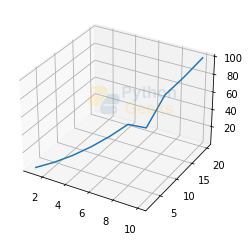
1. Line Plot
Example of 3D line plot :
import matplotlib.pyplot as plt

#creating the three values of the three axes
x = [1, 2, 3, 4, 5, 6, 7, 8, 9, 10]
y = [2, 4, 6, 8, 10, 12, 14, 16, 18, 20]
z = [1, 4, 9, 16, 25, 36, 29, 64, 81, 100]


# Creating the figure object
fig = plt.figure()

#creating the 3D coordinate axes
ax = plt.axes(projection = '3d')
ax.plot3D(x,y,z)
plt.show()
Output:
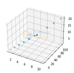
2. Scatterplot
Example of 3D scatter plot :
import matplotlib.pyplot as plt

#creating the three values of the three axes
x = [1, 2, 3, 4, 5, 6, 7, 8, 9, 10]
y = [2, 4, 6, 8, 10, 12, 14, 16, 18, 20]
z = [1, 4, 9, 16, 25, 36, 29, 64, 81, 100]


# Creating the figure object
fig = plt.figure()

#creating the 3D coordinate axes
ax = plt.axes(projection = '3d')
ax.scatter(x,z,y)
plt.show()
Output:
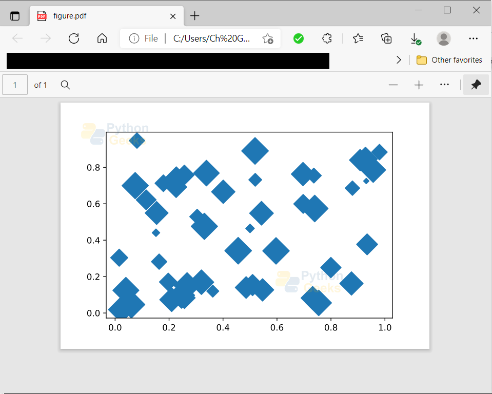
Saving Plot
We can save the plots using the savefig() function. Let us take the below plot and then we can use the function to save the figure.
Example of saving the plot:
import numpy as np
import matplotlib.pyplot as plt

#creating 3 variables holding an array of 50 random values in the range 0 to 1
x=np.random.rand(50)
y=np.random.rand(50)
sizes=np.random.rand(50)

plt.scatter(x,y,s=sizes*500,marker='D')
plt.savefig('figure.pdf',format='pdf') #saving the plot as a pdf file of name figure
Output:
Conclusion
We learned some more charts and their plotting using the Python Matplotlib module. We also discussed plotting 3D graphs. Hope this article helped you with learning charts. Happy learning!

It is indeed a fruitful work .I hope more info about graphics in python would be given with the passage of time.I am a retired Investigator Social Welfare,Women Empowerment and Special Education Department officer who is utilizing his precious time in working on programming in python and data sciences. Umar Zarin Khattak